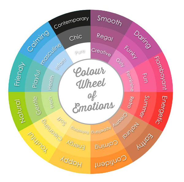
Colour is important to the visual experience. It’s a powerful tool because it can change our mood. Think about a recent advertisement that grabbed your attention. It may have motivated you through the bold red colours it used, or it may have calmed you by using cool blue shades. Alternatively, you may have perceived the red as aggressive and perhaps the overuse of blue as cold. This also applies in digital learning.
Colour creates an environment that fosters learning as it plays a significant role in memory performance by enhancing the absorption of information and facilitating the thinking process. Using the right colours can influence the attention, attitude and feelings of people as they learn.
When designing your next course, this Colour Wheel of Emotions might come in handy as you choose your colour palette.

Blue for thought
Cool colours such as blue tend to have a calming effect. Blue is good for promoting high levels of thought as it calms learners as they’re presented with complicated or overwhelming information. Although blue is essentially a soothing colour, it can be perceived as cold and unfriendly if you use too much in your design. Try balancing it with other colours.
Green for concentration
Green is refreshing and easy on the eye. Being at the centre of the colour spectrum, it’s the colour of balance and is an ideal choice for maintaining learner concentration. Studies have found that consumers spend more time shopping in stores that are painted green. If you want to enhance your learners’ concentration levels, then go green!
Red for attention
If you want to direct your learners’ attention to a specific point or boost their motivation, then go with red. Red evokes a sense of urgency. According to a study on the effects of colours, red makes us vigilant and helps us to perform tasks where careful attention is required. Although red is attention grabbing, it can be perceived as demanding and aggressive, so consider when and how you place it in your course.
Orange for stimulation
Since orange is a combination of red and yellow, it’s a warm colour, great for activating thinking and memory and, also preventing boredom. Try using orange particularly with content that can be perceived as dry and dull. It can be used to highlight key information and communicate activity. However, when using orange consider the brightness and saturation. Too bright, and you’ll give your audience a headache!
Tips for using colour
- Combine colours cleverly – don’t go overboard with colour. You’ll lose the effect of the colour palette if you use too many colours and your learner won’t know where to focus.
- Be consistent with the colours you use – this will help the learner to navigate the course.
- Select legible colour combinations – pay attention to the contrast between the text and background as it’s vital to the legibility of your content.
- Have a purpose for your colour palette – consider what mood you’re trying to achieve in your content. If you’re presenting your learners with complicated information, use blue and if you’re working with dry subject matter, consider using orange to engage.
I can hear you now asking about colours and company branding. When we design our courses, yes, more often than not we do face some limitations because of company branding guidelines. However, understanding how colours are perceived should make it easier for you as you choose the colour palette or accent colours as you work with the branding guidelines.
References
Adams FM, Osgood CE. A cross-cultural study of the affective meaning of color. J Cross Cult Psychol. 1973;4(2):135–156. https://www.ncbi.nlm.nih.gov/pmc/articles/PMC3743993/
Colour Affects. 2017. Colour Affects. [ONLINE] Available at: https://www.colour-affects.co.uk/how-it-works. [Accessed 31 July 2017].
Nicole Eberhard. 2017. The psychology of colour and its role in e-learning. [ONLINE] Available at: https://www.hubblestudios.com/psychology-of-colour-role-in-e-learning/. [Accessed 31 July 2017].
