Welcome back to our series on design fundamentals! So far, we’ve covered Contrast, Repetition, and Alignment—the unsung heroes of great visual communication. Today, we’re wrapping things up with the final pillar in the CRAP design principle framework: Proximity.
Let’s explore how this powerful concept can help you create cleaner, more effective layouts—even if you don’t consider yourself a designer.
What Is Proximity in Design?
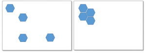
Proximity refers to the physical closeness between elements in your design. When items are near each other, our brains naturally assume they’re connected in some way. When they’re far apart, we tend to assume there’s no relationship.
In visual design—especially eLearning—this helps your learners understand which pieces of information belong together. Good proximity cuts down confusion, simplifies navigation, and creates a sense of harmony and order.
Think of it like visual grouping. Just as we might group groceries by type in our cart (veggies with veggies, frozen with frozen), you should group related content together on your slides or screens.
Why Proximity Is a Big Deal in eLearning
In an online learning environment, your learners are constantly trying to absorb new information. The last thing they need is to waste energy figuring out what goes with what. That’s where smart use of proximity becomes a game-changer.
By grouping related elements—such as a heading with its corresponding paragraph, or an image with its caption—you provide immediate visual cues. Your learner can then quickly scan and understand the structure without conscious effort.
Proximity reduces the cognitive load. And in instructional design, reducing that load means better learning outcomes.
Let’s Look at a Common Mistake
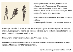
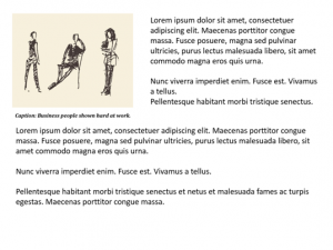
Imagine a slide where the caption for an image is placed far away from the image itself. The learner has to scan around to figure out what text goes with what visual.

The second example immediately makes more sense. The proximity between the image and its caption communicates their relationship—no extra explanation needed.
This concept applies to all types of grouped elements: bullet points under a heading, buttons near the actions they trigger, and instructions close to the activities they relate to.
Visual Proximity and Text Hierarchy
Headings, subheadings, and body text should each have clear relationships with the content around them. When done right, proximity supports hierarchy, showing learners what to read first, second, and third.
You can even use white space intentionally to define groups. More space between unrelated elements signals that the content belongs in separate categories. Less space between related items indicates unity.
The “Squint Test”: A Designer’s Shortcut
Here’s a tip from The Non-Designer’s Design Book by Robin Williams: squint your eyes and look at your design. If the layout feels chaotic or has too many “visual clusters,” chances are your proximity isn’t quite right.
You should be able to identify a few clear groups at a glance. If it all blends together or feels too scattered, it’s time to rearrange.
Avoiding False Connections
Sometimes, proximity can accidentally imply a relationship that doesn’t exist. This can lead to misunderstandings or confusion—especially when visual elements seem to support the wrong piece of content. Take this example:
Even though the photo is cute, it’s misleading if it doesn’t match the content. Thoughtful spacing helps prevent these visual mix-ups.
Quick Tips for Using Proximity Well
- Group related items together: Think text and images, headlines and body text, questions and answers.
- Reduce the number of separate visual elements: Combine related info to form stronger units.
- Use white space intentionally: Don’t be afraid of it—it’s a design tool!
- Avoid even spacing unless everything is truly equal: Equal distance can make everything seem equally important (and that’s rarely the case).
- Review with fresh eyes: Or better yet, get feedback from someone unfamiliar with the content.
Final Thoughts
Proximity might seem subtle, but it has the power to shape how your content is understood. It’s not about making things pretty—it’s about making things clear.
For non-designers, it’s one of the easiest principles to apply—and it delivers massive value. When your learners don’t have to guess what goes together, they can stay focused on what really matters: learning.
Take a look at your next design with proximity in mind. You’ll be surprised how much more polished and professional your work feels.
Need help applying proximity (and other visual principles) to your eLearning courses? Reach out to us—we’re here to help you bring your ideas to life.


