
If you’re not familiar with WCAG, they cover a wide range of recommendations for making Web content (including eLearning) more accessible to people with disabilities, including blindness and low vision, deafness and hearing loss, learning disabilities, cognitive limitations, limited movement, speech disabilities, photosensitivity as well as combinations of these. Applying these guidelines will also often make your web content more usable to users in general.
About WCAG 2.0
WCAG 2.0 is a stable, referenceable technical standard. It has 12 guidelines that are organised under 4 principles: perceivable, operable, understandable, and robust (or the acronym POUR). For each guideline, there are testable success criteria, which are at three levels: A, AA, and AAA. You can use this Quick Reference Guide to find out more about the requirements and success criteria.
The guidelines and success criteria lay the foundation necessary for anyone to access and use web content. Anyone producing content for the web must ensure that the content is:
Principle 1: Perceivable – users must be able to perceive the information being presented (it can’t be invisible to all of their senses).
How do you meet this principle?
- Provide text alternatives for non-text content.
- Provide captions and other alternatives for multimedia.
- Create content that can be presented in different ways, including by assistive technologies, without losing meaning.
- Make it easier for users to see and hear content.
Principle 2: Operable – users must be able to operate the interface (the interface cannot require interaction that a user cannot perform).
- Make all functionality available from a keyboard.
- Give users enough time to read and use content.
- Do not use content that causes seizures.
- Help users navigate and find content.
Principle 3: Understandable – users must be able to understand the information as well as the operation of the user interface (the content or operation cannot be beyond their understanding).
How do you meet this principle?
- Make text readable and understandable.
- Make content appear and operate in predictable ways.
- Help users avoid and correct mistakes.
Principle 4: Robust – users must be able to access the content as technologies advance (as technologies and user agents evolve, the content should remain accessible).
How do you meet this principle?
- Maximise compatibility with current and future user tools.
From these Principles and Guidelines you can see that there’s a number of things that an authoring tool like Storyline 2 will do for us. But there’s also a lot of things that we as designers have control over and we need to make design decisions in order for our eLearning to be accessible.
Let’s firstly take a look at Storyline and the specific improvements that have been made regarding accessibility:
- Custom tab order
- Use of sliders
- Customise the player font size.
For a full list of how Storyline meets WCAG, click here.
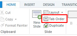
Custom Tab Order
Screen readers read on screen objects from left to right, top to bottom. Previously, if you had objects that weren’t arranged this way, the viewing order would be different to the screen arrangement which could be a problem because you may need information to be read in a particular order.
You can control the tabbing order. To do this the ‘Home’ tab and click ‘Tab Order’:
The window that appears will show all screen objects. To change their tab order click the ‘Create custom tab order’ radio button:
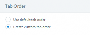
Then you’ll be able to select individual screen objects and use the arrow keys in the bottom right corner to move the object up and down the order. Make sure you save your new tab order.
You can also add alternate text to all screen objects that need them from here as well.
Support for Slider Interactions
Storyline provides for navigation via the Tab key and also using the Enter key to click on buttons etc. With update 5, slider interactions can now be used. The slider thumb can be moved by using the left and right arrow keys.
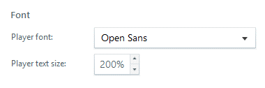
Custom Font Size
You can also, adjust the font size on the player up to 200% larger than normal. Go to the Player settings in Storyview, then click on Colours & Effects. In the Font area you adjust the player text size.
Before:

After:
As I mentioned, there are design decisions that we make which can impact on accessibility, for example the language used in the module, the colours and fonts we choose and the navigation through the module. Here’s a couple of things that we as designers can do to make our content more accessible.
Captions for Audio
Storyline doesn’t automatically create captions for your audio or video but there are a couple of options for each.
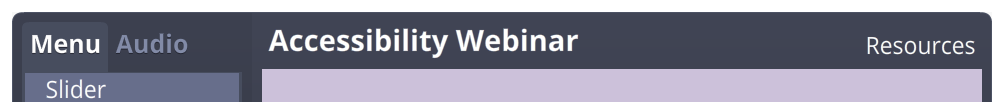
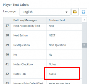
A quick way is to use Storylines built in the Notes panel and add a transcript of your text there. Then you’ll need to enable it in the Menu via ‘Player’ settings and then go to the ‘Text Labels’ area and rename the tab Audio in the ‘Custom Text’ column.
Remember, if the font is small in the notes panel, it will also be small in the audio tab area of the player (unless you’ve increased the player font size).
Closed Captions
Tom Kuhlmann recently wrote a couple of blog posts about creating Closed Captions for videos in Storyline courses and they make for good reading. I took his idea and created some closed captions for your audio, which makes them more dynamic than just having all the text in the notes panel.
I created some closed captions on a slide for some audio by using a text variable and then setting the value of the variable to equal small pieces of the text:
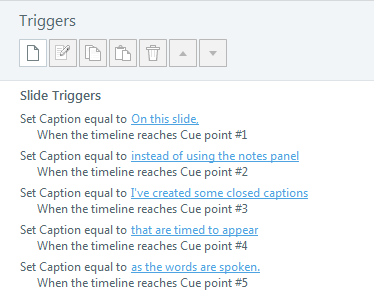
You can see I’ve used cue points on the timeline to change the caption text so that it is in sync with the audio but you could adjust the timings to suit your needs.
To display the captions on screen, I just inserted a black box with the reference to my caption text variable.

For this, it’s best to use white or yellow coloured text.
Contrast
While WCAG specifies the minimum amount of contrast between text colour and background colour, we need to test the contrast levels to make sure they meet the guidelines.
To meet Level AA, the contrast needs to be:
4.5 to 1 for normal text and 3 to 1 for large text (18pt or higher).
To meet Level AAA, the contrast needs to be:
7 to 1 for normal text and 4.5 to 1 for large text.
There is a website called webaim.org that has a lot of information about accessibility and they also have a handy tool called a Colour Contrast Checker that allows you to put in the hexadecimal value of the foreground (or text) colour and background colour and it will tell you if it meets the required level of contrast.
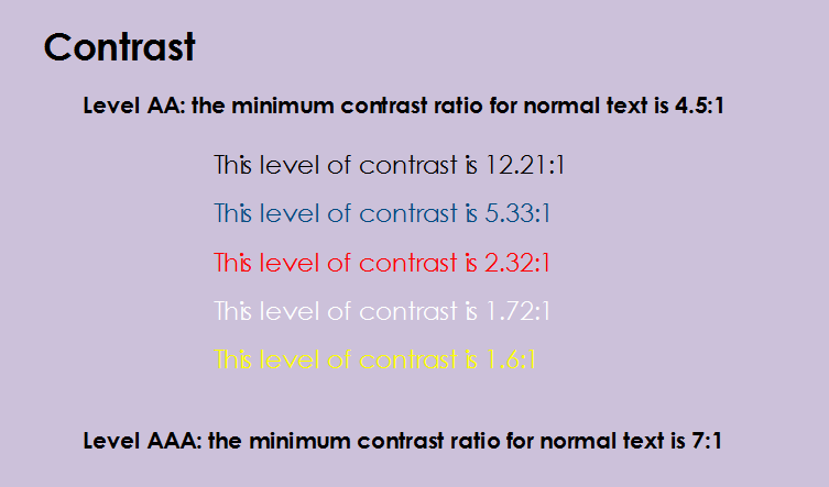
In this image, you can see different levels of contrast for text colours compared with the background colour. The black text would meet the guideline for both Levels A and AA, the blue for Level A only and the red, white and yellow would not meet for either level.
It’s important that we make our eLearning accessible for everyone and while Articulate Storyline takes care of some aspects of accessible eLearning, we need to incorporate design ideas that include everyone.
We recently held a webinar that covers accessibility in eLearning that you can watch here. Given the interest in creating accessible eLearning, we plan to hold more webinars in the future so if there’s an area of accessible eLearning you’d like to learn more about, please let me know in the comments area.
