Whenever I hear the word ‘contrast’ I always remember the old colour TV I grew up with in the 70’s (yes I know I’m a little old.)
No remote control, big silver spring loaded push button to turn it on, vacuum tube innards (I bet there are a few people out there that don’t even know what that is “Huh, your old TV could vacuum the floor as well?” – Google it, it’s what we use to have in TV’s before transistors and integrated circuits), a big old clunky channel changer for VHF signals, a dial for UHF, a slider for the volume, and two knobs helpfully labelled ‘Picture’ and ‘Contrast’.
Now the ‘Picture’ knob probably should have been titled ‘Brightness’ because when you turned it the image went from really dark, to impossibly saturated colours where the TV used to hum like it was a rocket about to take off. I guess the amount of power it used to pull out the super bright colours was quite a bit.
The ‘Contrast’ knob would use to take the picture from a hazy greyish blob to sharp black and white (or really pronounced colours) depending on where you set the control. The setting of the control was usually followed by my father yelling at me to “Stop mucking around with the tube! The news is about to start! And don’t even try to change over to that rubbish about some medical guy flying through time in a blue box, or those three jokers on the bicycle.”
The Contrast knob could make everything look hazy and the same, or it could make everything look starkly different. This idea is what is carried forward into design when you start discussing ‘Contrast’
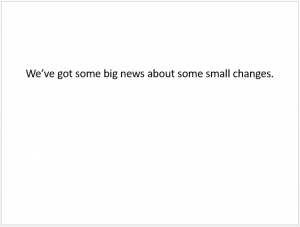
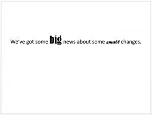
Contrast in design simply means ‘difference’. A boring design is where everything looks the same.
If you want to draw people’s attention to something specific, make it look different. Not just a little different, but a lot different.
Our brains look for differences all the time “which of these things are not like the other…and why?” It engages our brain and gets it thinking. We notice things that look different.
In design you can contrast a number of differing elements. You can contrast layouts, fonts and even colours.
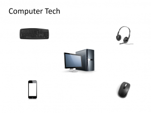
However you also need to use a little finesse when you contrast items, because some contrasts can be quite jarring. Have a look at the following example:
With the red background, the white title looks ok, but the blocks of white behind the equipment look horrible. They are definitely contrasting, just not in a good way! If we change the red background to white, and the title to black, we clean up the design considerably and now it looks much cleaner.
The ‘black’ of the equipment contrasts in a way to make them stand out without clashing too much with its surrounds. We would still need to play around with alignment and layout, but it’s already a good step forward.
If you wanted to keep the red background, you could replace all the black hardware with white versions, and this would achieve the same effect. Abrupt contrast is not a good thing. But planned contrast certainly is.
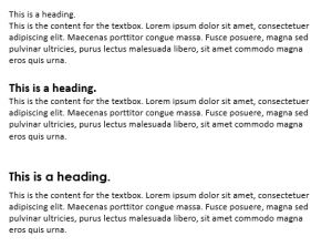
When it comes to your text which looks better:
Generally the second textbox or even the third would be preferable to the first. In the first box the lack of contrast between the heading and the body make it difficult to even tell if there is a title for the text.
The second one by bolding and upping the size of the first line of text, makes it easier to tell it is a heading because it looks different to the rest of the text.
The final text box takes this a step further by changing the first sentence’s font, and adding a small space between them. This contrast makes it easier to see that one piece of text is a heading and the second is the body content.
Contrast in text can be achieved through differing typefaces, font sizes, colour and even alignment.
Experiment with how your text looks play with different typefaces and fonts. There is a great website that allows you to get inspiration for pairing fonts for your projects. It is called Font Flame. Check it out for some great ideas for contrasting fonts.
Contrasting colours is a science unto itself.
There are simply millions of colours out in the big bad world. It’s simple to throw colour together, but does it look any good? An easy way to get a good list of contrasting colours is to look at any sports team and see the colours they use in their uniforms. You could work through the NRL or AFL teams and have a number of colour pairings that work. (Yes ok some are better than others, but a lot of them and pretty good). Or you could play with some colours yourself. For example:
Black and white, being neutral colours tend to look ok with most other colours. Though you might lean more towards the white in the above example for ease of reading and brighter contrast then the black. The yellow isn’t too bad either, though you would traditionally think it doesn’t have enough contrast. That’s ok. Sometimes it doesn’t need to be a huge amount of contrast to make something look good. The yellow and orange are close shades, but it’s enough to make them stand out and even though they contrast, they also complement each other to a degree. The green is quite jarring when you first look at it, which is surprising considering that most people consider them to be good contrasting colours. It might just be this particular shade I have chosen that isn’t any good. If these were you chosen colours you might want to experiment with different shades to find one that contrasts well.
Colour is a great medium to play with, and I look forward to going into it in more detail in a later blog post. In the meantime Adobe’s Color CC tool is a great resource to not only find colour schemes, but also play around with creating your own.
Design is not an exact science. Sometimes a lot of good design comes down to ‘gut feeling’ and what ‘looks or feels right’. Remember to experiment and look at how others have played with contrast in their designs. Check out Articulate E-Learning Heroes for examples, or any online learning you have had to complete yourself. What did the designer do to provide good contrast with their elements?
Remember it’s not about copying other people’s design, but using theirs to inspire your own.
