
One of the first things to do when starting an eLearning project is to find out if a client has a corporate style guide or branding document. This document sets out the colours as well as their typeface styles and size, and the type of imagery or design elements (such as logos) they use in their internal and external communications. These guidelines should then be adhered to consistently to ensure that any document or product (including eLearning material) matches the corporate look and feel, and is easily recognisable as that particular brand. This information can then be used to develop a client-specific eLearning style guide.
Making an eLearning style guide for a client is relatively straightforward and provides them with an invaluable one-page reference to ensure all material is on brand. Let’s start with a PowerPoint template that we have made for this purpose:
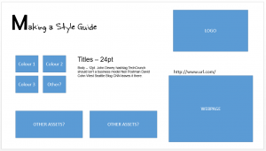
It’s a fairly simple design. It has boxes to capture the client’s colours, a space for their logo, maybe a screen capture of their website for some inspiration, a place to record their corporate fonts, and some space to capture any other interesting assets.
1. Use company logos
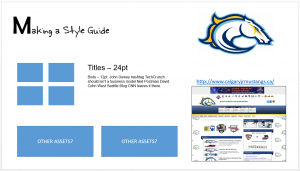
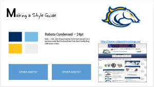
Most organisations have a logo of some kind, you can usually locate it online, or the client will provide the files. The example below is a mock-up, with the client being the ice hockey team the Calgary Mustangs. After capturing their logo and webpage, the guide looks like this:
2. Capture corporate colours
One of the handiest tools available in most image-based software programs is the eyedropper tool. This humble little tool gives a visual designer a lot of power The eyedropper tool can extract the colours out of the logo and fill the colour boxes. To do this in Articulate Storyline you:
- Select a box
- Select the format tab on the ribbon
- Click the little drop down arrow next to the shape fill option
- Select the eyedropper tool
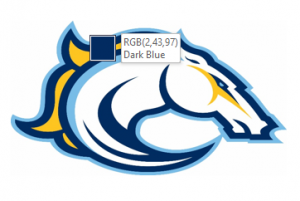
- Then click on one of the colours in the logo to capture it. The box will change to match the colour selected with the eyedropper tool.
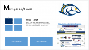
Colour 1 captured. Now repeat the process to get the rest:
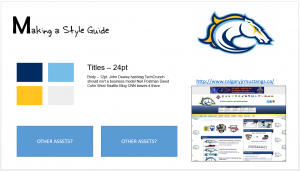
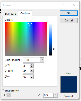
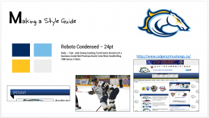
Now we have the colours for the design. In the above example the the two blues and the yellow have been extracted from the logo, and the warm grey from the website. To transfer these colours to another software package, write down the RGB code shown when you hover over the colour with the eyedropper, or you can select the coloured box you want the RGB code for and then click Format > Shape Fill > More Fill Colours > Custom to discover what it is.
3. Fonts
Most of the time the client will let you know which font is their official corporate font. If for whatever reason they don’t know, there are some other ways to work it out. The easiest way is to refer to the website.
Open the website in your browser and then press F12 if you are using Internet Explorer, (in any other browser select the menu item View > Source). In IE this will take you to the Developer’s Console. Don’t be scared! You’re not going to break anything here, and we’re only looking for the font types they have used. Select the menu item DOM explorer, and on the right-hand side of the screen you will see a reference to the font family used:
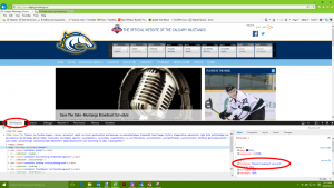
The font used here is Roboto Condensed. Yay! Now we know the font we need. You may already have it, or you can use the name to locate it at a later date.
If you can’t find the reference as above, or if you are using another browser, use the Find menu option by pressing CTRL + F, and search for ‘font-family’ in the HTML code to discover which font they have used.
Now knowing the font, include it in the style guide, and if installed change the copy to match.
4. Assets
Looking good! The eLearning style guide is mostly done. The last part refers to other assets. This is where you make a note or take a screen capture of any other related assets that could be used as visual design inspiration.
The Mustangs have an interesting title banner that they use throughout the site, so I’ve grabbed a quick screen capture of it as a source of inspiration for any title banners I may need to create as part of my design. Also, they are first and foremost an ice hockey team, so a picture of one of their players in uniform could be useful for further ideas.
Here is how the style guide is looking:
It’s all done! We now have a quick one-page reference on the style and look and feel of the Mustangs, to help when building a design concept for a module. The last thing to do is confirm with the client that the guide hits the mark and accurately captures their style before launching into full design concept mode.
As you can see, making an eLearning style guide is quick and easy and is really helpful when you want to get a quick feel for a client’s style before launching into full visual design mode. Keep this with your project materials to refer to whenever you need it.
Looking to learn how to use Articulate Rise or Storyline? Find out about our Certified Articulate Training here.
