In a recent Certified Articulate Training workshop, I was asked if it was really worthwhile using audio in our online modules. The person who asked the question had previous negative experiences where audio was used. It reminded me of the Modality Principle that I had read about in Clark and Mayer’s eLearning and the Science of Instruction. It was time to blow the dust off the book that was gathering dust on my shelf and remind myself of this principle and how it affects us as learning designers.
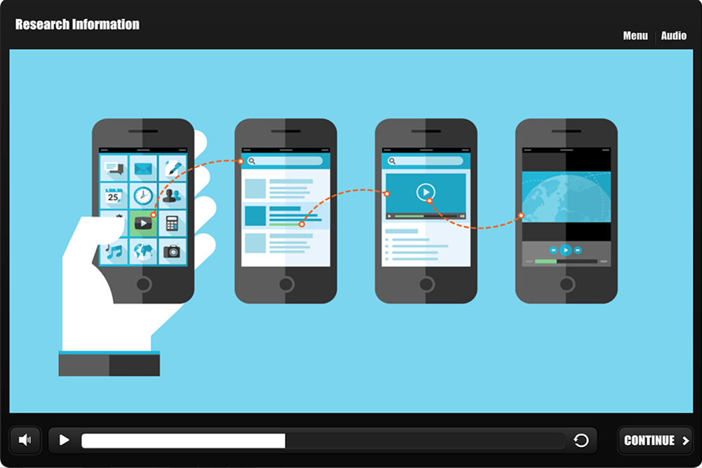
The Modality Principle is where the designer ‘presents words as speech rather than on-screen text’ (Clark & Mayer 2011). The book recommends you ‘put words in spoken form rather than printed form whenever the graphic (animation, video, or series of static frames) is the focus of the words and both and presented simultaneously’. During our eLearning workshops, I like to show this example that was created by Tom Kuhlmann a few years ago. It looks at presenting information in four different ways. The final screen is aligned to the concept of the Modality Principle. This simple example is a reminder of how we make sense of information presented to us.
Allowing the learner to listen to an explanation of a picture/s or diagram means that there is less demand on the visual/pictorial channel. In turn this allows our temporary processing memory to help us understand things in a more effective way just like the cell tower example above. To put this simply, we can help reduce cognitive overload by using graphics and audio to present information so that the graphics are processed through the visual channel and the audio processed through the auditory channel. In this way neither channel is overloaded, but both words and pictures are processed (Clark and Mayer 2011).
Like many of our models and theories, there are limitations to take into account when applying the Modality Principle. It may not be suitable for certain situations:
- Some organisations may not support the use of audio in their online modules
- When creating content related to certain subject e.g. mathematical formulas, the one screen text should really remain on the screen even if the audio is describing each component
- Certain tutorials such as screen simulations usually require a mixture of text, audio and media
Clark and Mayer (2011) highlight that the job of the learning designer is to present information but to ‘also present it in a way that is consistent with how people learn’. For us as designers, that means getting the right balance when working with our content to create meaningful learning experiences.
To get the right balance I would suggest:
- Writing your narration script first and then try and visualise what would happen on each screen. This can be done whether you use a storyboard or a rapid prototyping.
- ‘Scrapping’ existing PowerPoint slides and start from scratch as this can affect how you perceive the content. In the past I have found myself being influenced by the design of existing PowerPoint material especially when I had to develop a course quickly.
- Before you begin development, find out if you can source appropriate graphics that can help illustrate these new concepts. If these are not provided by your Subject Matter Expert, then maybe check that they will be appropriate.
